
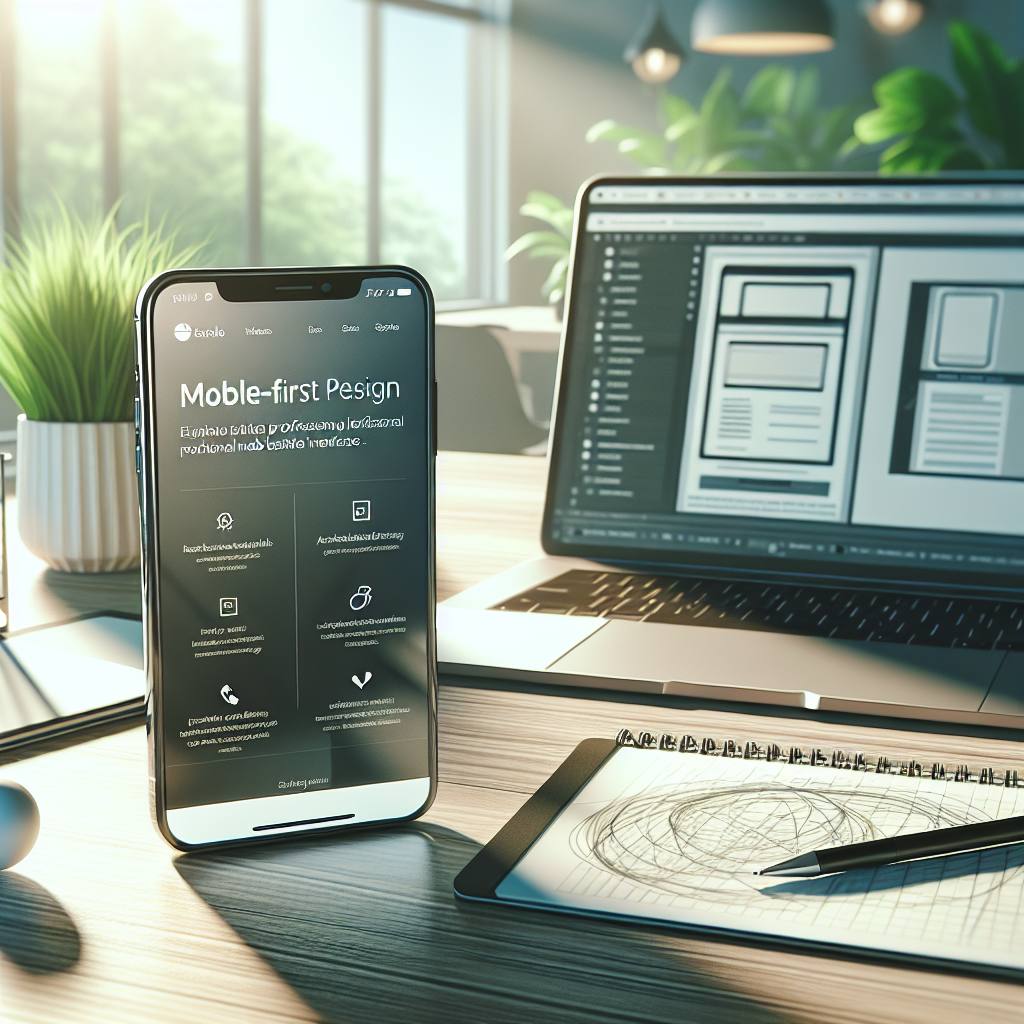
In today’s digital landscape, the importance of mobile optimization cannot be overstated. As of December 2025, mobile devices account for over 60% of internet traffic globally. For Dorset businesses, failing to prioritize mobile-first design can result in lost opportunities and decreased customer engagement. In this blog post, we will explore the essential elements of mobile optimization, the benefits it brings to local businesses, and actionable steps for implementing a mobile-first design strategy.
Understanding Mobile-First Design
Mobile-first design is an approach that prioritizes the design and development of websites for mobile devices before scaling up to desktop versions. This method ensures that the user experience is seamless and efficient, regardless of the device being used. Here are some critical aspects of mobile-first design:
- Responsive Layout: Websites should adapt to different screen sizes, ensuring an optimal viewing experience on smartphones, tablets, and desktops.
- Touch-Friendly Navigation: Mobile users interact with screens using their fingers, so buttons and links need to be large enough for easy tapping.
- Fast Loading Times: Mobile users expect quick access to information. Optimizing images and minimizing code can significantly improve loading speeds.
The Importance of Mobile Optimization for Dorset Businesses
Enhanced User Experience: A mobile-optimized website provides a better user experience, leading to higher customer satisfaction. When users can easily navigate your site, they are more likely to stay longer and engage with your content.
Improved SEO Rankings: Search engines, particularly Google, prioritize mobile-friendly websites in their rankings. By optimizing your website for mobile, you can boost your visibility in search results, driving more organic traffic to your site.
Increased Conversion Rates: A seamless mobile experience can lead to higher conversion rates. Whether it’s making a purchase, signing up for a newsletter, or filling out a contact form, mobile optimization can simplify the process for users.
Competitive Advantage: Many local businesses in Dorset may not have fully embraced mobile-first design. By prioritizing this approach, you can differentiate your business from competitors and capture a larger market share.
Key Features of a Mobile-Optimized Website
To ensure your website is effectively optimized for mobile users, consider incorporating the following features:
1. Responsive Design
- Use flexible grid layouts that adjust based on the user’s screen size.
- Ensure images scale correctly and maintain their aspect ratio.
2. Simplified Navigation
- Implement a hamburger menu to save space and keep navigation intuitive.
- Limit the number of menu items to avoid overwhelming users.
3. Fast Load Times
- Optimize images using formats like WebP or AVIF for faster loading.
- Minimize the use of heavy scripts and unnecessary plugins.
4. Clear Calls to Action (CTAs)
- Use contrasting colors and prominent placement for CTAs to ensure they stand out.
- Keep CTAs concise and action-oriented (e.g., “Get a Quote,” “Sign Up”).
5. Touch-Friendly Design
- Ensure buttons and links are large enough for easy tapping.
- Avoid hover effects, as they do not work on touch screens.
Implementing Mobile-First Design: A Step-By-Step Guide
Analyze Your Current Website: Use tools like Google’s Mobile-Friendly Test to assess how well your current site performs on mobile devices.
Create a Mobile-First Strategy:
- Prioritize content that is most relevant to mobile users.
- Develop wireframes and prototypes focusing on mobile layouts.
Focus on Content:
- Use short paragraphs and bullet points to make content easy to read.
- Consider mobile user intent and ensure your content meets their needs.
Test, Test, Test:
- Conduct user testing on various devices to identify issues and gather feedback.
- Regularly monitor your website’s performance and make adjustments as needed.
Stay Updated: Mobile technology is constantly evolving. Keep abreast of new design trends and best practices to ensure your website remains competitive.
The Role of 4B Design in Your Mobile Optimization Journey
At 4B Design, we specialize in creating stunning, mobile-optimized websites tailored to the needs of businesses in Dorset. Our services include:
- Website Design: We create responsive, engaging designs that resonate with your target audience.
- WordPress Plugin Development: Our custom plugins enhance functionality and improve the user experience.
- Web Applications: We develop intuitive web applications that streamline processes and enhance customer interactions.
- Hosting Services: Our reliable hosting solutions ensure your website loads quickly and remains accessible to users around the clock.
- SEO Services: We implement effective SEO strategies to improve your website’s ranking and drive organic traffic.
Conclusion
In December 2025, mobile optimization is no longer an option; it’s a necessity for Dorset businesses looking to thrive in the competitive digital landscape. By embracing mobile-first design principles, you can enhance user experience, improve SEO rankings, and ultimately increase conversion rates. At 4B Design, we are here to help you navigate this transition and ensure your online presence is optimized for mobile users. Contact us today to learn more about our website design and digital marketing services tailored to your business needs.