
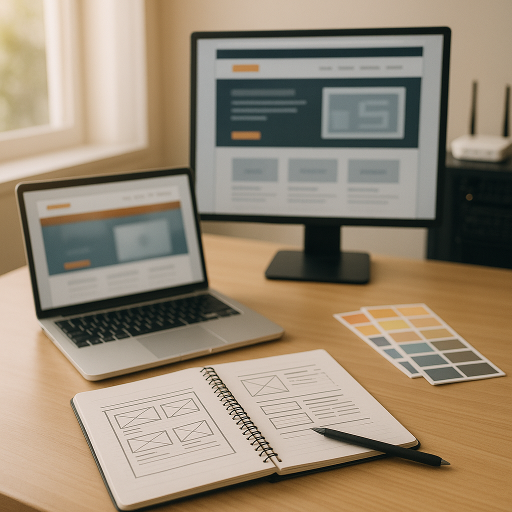
In today’s digital landscape, where users access websites on various devices, ensuring a seamless user experience is crucial for any business. For small businesses and local service providers in Dorset, a well-designed website can be the difference between attracting new customers and losing them to competitors. One of the most effective ways to enhance user experience is through responsive website design. This approach allows your site to adapt to different screen sizes and devices, which can significantly impact engagement and conversion rates.
Understanding Responsive Website Design
Responsive website design is a design methodology that enables a website to adjust its layout and content based on the screen size and orientation of the device being used. This means that whether a potential customer is using a desktop, tablet, or smartphone, they will have a consistent and user-friendly experience.
Key Benefits of Responsive Website Design
Improved User Experience
- A responsive design ensures that your website is easy to navigate, regardless of the device. This leads to lower bounce rates and higher user satisfaction. Users are more likely to stay on a site that is visually appealing and easy to use.
Increased Mobile Traffic
- With a significant portion of web traffic coming from mobile devices, having a responsive website is essential. Google has also started prioritising mobile-friendly sites in its search results, meaning a responsive design could enhance your visibility online.
Cost-Effectiveness
- Instead of maintaining separate websites for different devices, responsive design consolidates your efforts into a single site. This not only reduces maintenance costs but also streamlines your marketing efforts, as you can direct all traffic to one URL.
Better SEO Performance
- Google recommends responsive design as it helps maintain consistent content across platforms. A unified URL structure simplifies the indexing process for search engines, potentially leading to better search rankings.
Faster Load Times
- Responsive designs often lead to optimised images and assets, which can significantly reduce load times. Faster loading sites enhance user experience and are favoured by search engines.
How to Implement Responsive Website Design
When considering a responsive design for your business website, follow these steps:
1. Assess Current Website Performance
- Use tools like Google Analytics to determine how many of your visitors are accessing your site from mobile devices. This data will help you understand the need for a responsive design.
2. Choose a Responsive Framework
- Select a responsive web design framework, such as Bootstrap or Foundation, which includes pre-built components that adapt to different screen sizes.
3. Prioritise Content
- Determine the most important content for your users and ensure it is easily accessible on all devices. You may need to adjust how content is displayed based on screen size.
4. Test Across Devices
- Regularly test your website on different devices and browsers to ensure compatibility. Tools like BrowserStack allow you to assess how your site performs across various environments.
5. Monitor and Optimise
- Once your responsive design is live, continue to monitor its performance. Use A/B testing to compare different layouts and designs to identify what works best for your audience.
Common Mistakes to Avoid
As you embark on creating a responsive website, be mindful of these common pitfalls:
- Ignoring User Behaviour: Understand how your target audience interacts with your site. For instance, mobile users may prefer simple navigation and quick access to information.
- Neglecting Load Speed: A beautiful responsive website is useless if it takes too long to load. Ensure images are optimised and scripts are minimised.
- Overcomplicating Design: Keep your design clean and straightforward. Excessive elements can confuse users, especially on smaller screens.
- Failing to Update Regularly: Responsive design is not a one-time task. As technology evolves, so should your website. Regular updates ensure ongoing compatibility and performance.
Conclusion
The benefits of responsive website design are undeniable. For small businesses and local services in Dorset, investing in a responsive design can lead to enhanced user experience, increased traffic, and improved conversion rates. By prioritising a responsive approach, you position your business for success in an increasingly mobile world.
If you’re looking to improve your website’s performance and user experience, consider our professional website design services. We specialise in creating responsive websites tailored to the needs of Dorset businesses, ensuring you stay competitive in the digital landscape.